Over the years, the WWF Living Planet Report has thrown up many strange inconsistencies that suggest active manipulation to hide positive data and exaggerate negative results.
The Worldwide Fund for Nature, which refuses to be known as the WFN, instead clinging to the WWF initialism it wrestled away from the one-time World Wrestling Federation, publishes an ‘end of the world warning’ every two years.
Called the Living Planet Report, it purports to document humanity’s impact on Earth’s ecosystems. Its headline numbers are an estimate of how global wildlife populations have changed since 1970, and how humanity’s ecological footprint fares against a measure called ‘biocapacity’ since 1961.
In the Living Planet Report 2022, the numbers are stark: our footprint allegedly exceeds the planet’s carrying capacity by 75%, and wildlife populations have declined by a staggering 69%.
This headline went around social media: ‘70% of animal species around the world have been wiped out since 1970’.
Wrong. The report was about populations, not species. There is little doubt that humanity has a significant negative impact on biodiversity, but species extinctions are documented surprisingly rarely, given how frequent they’re claimed to be in the speculative literature.
Granted, Hunger, a quarterly culture and fashion magazine founded in London in 2011 might not be the best source for reliable environmental information.
Critical
Let’s turn to Our Burning Planet, then, in South Africa’s very own Daily Maverick: ‘It’s Code Red for the survival of all wild creatures — and ultimately humanity’.
Oh dear. This, too, sounds serious. But we know that Our Burning Planet is a relentless drumbeat of apocalyptic alarmism, and would gobble up statistics such as these without too much critical examination.
In its defence, the article does turn critical on the WWF itself, arguing that it has largely failed in its very well-funded mission since its founding in 1961, and listing several major scandals that the group has been embroiled in over the years. Curiously, it only lists the scandals about the corporate sources of WWF funding, corporate ‘greenwashing’, and the WWF’s profitable investments in fossil fuel companies.
The purpose of that criticism is to encourage the WWF to be even bolder and more forceful in its advocacy.
A scandal that the Daily Maverick article fails to mention is about exactly how forceful the WWF can get, sponsoring ‘rangers’ or ‘guards’ in various developing countries who tortured, raped and killed people, including children.
Pattern
Let’s have a look at those headline numbers and how they are constructed, however. A pattern of hiding positive data and exaggerating negative data will emerge.
The harder the WWF works on documenting population declines, the more wildlife populations appear to decline.
This time, the Living Planet Index (LPI), which appears to be a simple average of the estimated changes in 32 000 species, records a 69% decline since 1970.
This is not inconsistent with the decline in the 2020 report, of 68%. Looking back further, however, things become a little odd. In 2018, the decline stood at 60%. In 2016, it came in at a mere 38%. In 2014, it was 52%, and in 2012, it stood at 28%.
These numbers vary wildly, suggesting that perhaps the idea of trying to assess tens of thousands of individual species populations, and then averaging them to reach an alarming headline number, is deeply flawed.
More damningly, every report features a neatly down-trending line, which is simply adjusted to whatever final number they reach in that particular year. The 2014 report’s chart was not consistent with the 2012 chart, and so on, up to at least 2020.
One of the reasons for the sharp (if wildly volatile) increase in estimated population declines from 28% in 2012 to 69% in 2022 is that the report includes more and more species of fish and invertebrates.
In 2012, they sampled less than 10 000 species. In 2022, they sampled 32 000. Populations of fish and invertebrates are far harder to estimate, and often fluctuate significantly from season to season.
They are also far more subject to the tragedy of the commons. Because property rights are hard to establish and enforce at sea, marine resources tend to get over-exploited compared with land-based resources. This serves the WWF’s messaging goals, because the poor performance of marine species can be extrapolated to all species by simple averaging.
Category games
In the 2012 report, the WWF split the LPI between tropical and temperate. The tropical LPI showed an alarming 61% decline, but the temperate LPI showed a 31% increase. By 2014, however, the temperate LPI had suddenly turned negative, to a decline of 36%, even though the total population count had risen only marginally, from 9 014 to 10 380.
That is a staggering (and entirely implausible) turnaround, but could certainly account for the remarkable change from a 28% decline to a 52% decline in the headline number in a mere two years.
The WWF no longer splits the LPI into temperate and tropical, nor into terrestrial, marine and freshwater indices, as it once did, despite the apparent scientific utility of this approach.
The problem for the WWF is that these divisions show good news as well as bad news. In the 2012 report it shows, for example, that temperate marine species increased by 53%, and temperate freshwater species by 36%.
Can’t have that. So, they needed new categories. First, it split the LPI into five ‘realms’, called neotropical (roughly corresponding with South and Latin America), nearctic (the rest of North America), afrotropical (mostly sub-Saharan Africa with a few countries from the Arabian peninsula thrown in), palearctic (North Africa, Europe, and most of Asia), and indo-pacific (India, South-East Asia and Australasia).
All of these showed declines, which is exactly what the WWF wanted.
Then, in 2020, it split the LPI into five Intergovernmental Science-Policy Platform on Biodiversity and Ecosystem Services (IPBES) regions, instead. These were South America, North America, Africa, Europe and Central Asia, and Asia and Australasia. (Why the border between Russia and China/Mongolia is significant, from a biodiversity point of view, is a mystery to me.)
Again, all of these regions show declines.
Embarrassing positive results
This inconsistent categorisation makes it impossible to compare numbers between different editions of the report; an obfuscation which is likely deliberate.
It doesn’t, however, produce embarrassing positive results. The declines in each region vary dramatically, however, from an average population decline of 18% in Europe and Central Asia to a decline of 94% in South America. I find this latter number extremely hard to believe, even if 20% of the Amazon rainforest has been lost since 1970.
Instead of neatly setting out the terrestrial, freshwater and marine division, and the tropical vs temperate division, the 2022 report simply cherry-picks the worst one, namely the freshwater LPI, which declined by 83%, and ignores the rest.
It wouldn’t do to highlight any categories that are not in apparently catastrophic decline.
There is also the question of how the baseline was established. I can buy that far more species populations are documented today than ever before, but it strikes me as implausible that all 32 000 species in the report were consistently and reliably documented since 1970.
Just as all the positive indicators in previous reports have been systematically erased from the more recent reports, I suspect that a lot of cherry-picking, extrapolation and interpolation has taken place to produce these tidy headline numbers that all seem to point in the wrong direction.
Biocapacity
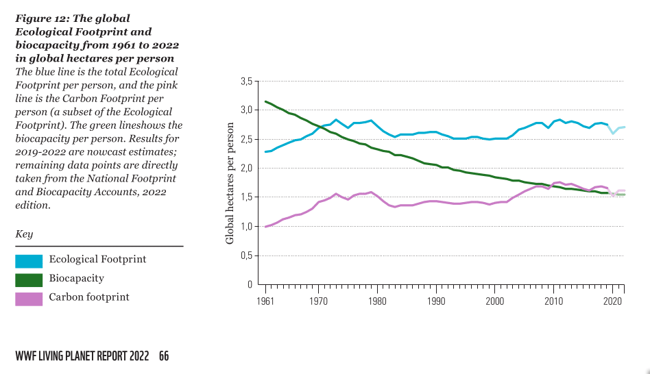
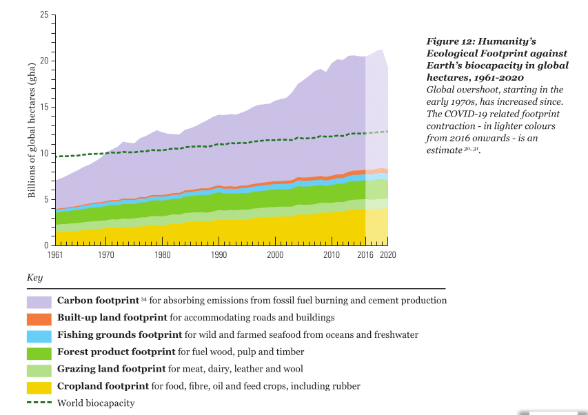
In this year’s report, the WWF has a chart that shows how humanity’s ecological footprint exceeds the world’s ‘biocapacity’.

You’ll note, firstly, that humanity’s footprint would not get even close to this supposed ‘biocapacity’ if they didn’t attribute a massive 60% of that footprint to carbon dioxide emissions.
You’ll also note that biocapacity per person has declined steadily, more than halving since 1961 from over three hectares to about 1,5ha.
This will come as a surprise to readers of previous Living Planet Reports. In 2020, for example, they showed that ‘biocapacity’ has been steadily rising since 1961. And until 2014, biocapacity was a straight horizontal line, simply labelled ‘number of planet Earths’.

Rising biocapacity would make sense, of course, since agriculture in particular has become far more efficient, so much so that we likely reached Peak Farmland a decade ago.
Of course, the difference is that in 2022, they decided to plot biocapacity not as a global total, but as a function of population. Again, this makes the report impossible to compare with its predecessors, but never mind, because it does produce a more pessimistic-looking chart.
They ran into a problem switching from totals to per capita numbers, however. That is that the ecological footprint of humanity, not counting carbon emissions, has declined per capita. While world population grew 158% from 3,04 billion in 1961 to 7,84 billion in 2020, our non-carbon ecological footprint grew by only 113%. This translates into a 17,5% reduction in the footprint per capita.
Manipulating charts
We can’t have things getting better, of course, since that would conflict with the WWF’s alarmist message, so that inconvenient fact had to be hidden. The way to do that is to change the order in which the elements of the footprint are stacked in the chart.
By stacking the carbon contribution at the bottom, instead of on top like it did in 2020, it looks like everything went up, when in fact, only the 60% of the footprint they attribute to carbon emissions went up, while every other measure actually got better, per capita.
That also hides that it is their estimate of humanity’s carbon footprint that accounts for the entirety of their claim that ‘humanity overuses our planet by at least 75%, the equivalent to living off 1,75 Earths’. Without that, we’d be at about two thirds of carrying capacity.
How biocapacity is defined is yet another questionable data point. They appear to choose a number of ‘global hectares’ that are supposed to represent all the ecosystem services that humanity requires. For some reason, this number is roughly 20% less than the Earth’s actual land surface area, and ignores the oceans altogether.
Even with the best will in the world, they couldn’t have created more than a very rough approximation, based on a range of thumb-suck assumptions, likely with wide error margins.
Those assumptions do not appear to give much weight to more efficient use of agricultural land, or the fact that more prosperous nations consistently outperform developing countries on environmental performance indices.
That would suggest that becoming more prosperous might offer a solution to environmental degradation, but that isn’t the message the WWF wants to send. On the contrary, they explicitly blame ‘rapid economic growth’, along with ‘international trade’ for all the ills in the world.
Exaggeration
I have no doubt that biodiversity, environmental sustainability, and ecosystem services should be taken seriously. I have no doubt that both are facing threats. I cannot, however, take the word of an organisation that seems to draw bold conclusions from speculative, inconsistent and sparse data, and clearly manipulates statistics to support pre-conceived conclusions.
That leads to exaggeration, such as that wildlife population losses foretell the ‘end of the world’, or that the survival of all species, including humanity, are at stake.
Exaggeration might be good for fund-raising, which is what the WWF does very well (after all, its top executives earn almost $1 million a year, and that life of luxury has to come from somewhere). It is not good for policy-making, however.
The world faces many problems. Exaggerating (or minimising) any of them leads to misallocating effort and resources, which can ultimately make many of those problems worse.
The WWF recommends ‘enacting and enforcing restrictions on fossil fuels, making laws to protect endangered species and spaces, funding ecological restoration, phasing out and better regulating extractive industries, requiring businesses to carry out human rights and environmental due diligence across their supply chains, ending subsidies that encourage activities that degrade ecosystems, and shifting to sustainable production and consumption, including the transition to a circular economy’.
All of these ideas come at a cost, and some of them are wildly utopian, like establishing a circular economy and phasing out extractive industries.
It would be a shame if activist exaggeration of the state of the planet leads governments to enact measures that are so draconian that they threaten equally worthy policy objectives, such as eradicating poverty, or allowing poor countries to develop rapidly into prosperous nations that can afford to improve their environmental performance.
I don’t believe the WWF is even remotely honest in its assessment, and therefore, it would be foolish to base any decisions on its alarmist numbers and radical recommendations.
[Image: PabloEsteban from Pixabay]
The views of the writer are not necessarily the views of the Daily Friend or the IRR
If you like what you have just read, support the Daily Friend

