Max Price
I write this in response to Gabriel Crouse’s Much Worse than you Think, published by the Daily Friend on 19 May, to make two points.
- Mr Crouse alleges that I have been ‘misleading the nation with specious graphs’. I would not object if he were challenging my statistical approach, or even my competence. That is the stuff of scientific progress. But as someone with a formal training in epidemiology and statistics, and a long-term professional commitment to trying to make sense of data (see here, and here, and here), I take offence at his implication that I have a personal ideological agenda to which ends I am manipulating the data. No evidence is provided by Mr Crouse that I have such an agenda or that I have not applied my tools of trade appropriately. That style of attack has a chilling effect on scientific debate, attacking the messenger instead of the message. I would rather have a serious scientific debate about the relative merits of particular aspects of evidence and its interpretation.
- In this spirit, I contest Mr Crouse’s analysis and conclusions, in several respects, and I hope to do so without casting doubt on his bona fides.
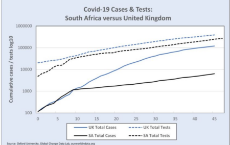
Mr Crouse takes issue with a graph I had published. He asserts that I have (wilfully) misrepresented the change in the rate of increase of cases in South Africa (see ‘SA Total Cases’ in graph below). He argues that the kink that occurs around 27 March is not a real change in cases, but is a result of the number of tests that changed around that time (see ‘SA Total Tests’ in the graph), that is, that, since the rate of increase of tests dropped after 27 April, the identification of new cases dropped in proportion, and that this explains, in his view, the SA curve.
Cause and effect
In my view, he is wrong, and has reversed the cause and effect. During March and at least the first two weeks of April, testing was only done to confirm cases with a high suspicion of being Covid-19 infections. In general, these tests were only being done at health facilities on patients who presented with symptoms, or on high-risk individuals who had returned from certain countries, and close contacts of patients with a high probability for being infected.
The tests were not the result of community outreach screening programmes. In other words, the number of tests being done at any time was a consequence of the number of cases presenting, and would have varied with the changes in numbers of cases. Hence, when the rate of new cases dropped after 27 March, the daily number of tests dropped. So, yes, there is a kink in the graph of tests, but that largely is because there was a kink in the graph of cases. So my assertion stands, (and, let me say, I have not heard any serious analyst dispute this) that the rate of increase in cases in South Africa really did decline around 27 March.
Now that does not prove that the decline had anything to do with the declaration of the state of disaster two weeks earlier, or with the lockdown on the 27th. I’ll come back to that. But Mr Crouse’s view that the actual trajectories of the epidemics in South Africa and the UK were not really different, is wrong.
He then goes on to examine the patterns of testing and makes the following allegation.
“Leading up to the lockdown, we ramped up testing aggressively, and then spiked at 8 066 tests on 27 March. Then testing dropped to half that rate in a day, and then in half again in a week, and then eventually to zero on 6 April. No other country has done this. No other ‘Command Council’ locked a country down to drop, and then stop, testing.”
Misinterpreted the data
I think Crouse has misinterpreted (not misrepresented) the data on testing, attributing quite inappropriate significance to daily rates and daily fluctuations. For example, he has incorrectly assumed that if there is no data for tests on a specific day (e.g. 6 April) then zero tests were done. In fact, it is simply missing data for that day. He has assumed that tests should be fairly even and consistent, but the rates on weekends are often lower than weekdays. And since there are variable delays in getting the tests processed and results returned – anywhere up to 7 days – this makes a mess of daily test figures.
Relying inappropriately on daily figures has led Crouse to the belief that testing was intentionally ramped up to a peak on 27 March. The number on that day (8 066) is about double the number the day before and the day after. But on 25 March, it appears there were no tests, while on the 24th and 26th there were between 3 000 and 5 000. The most likely interpretation is that there were indeed about 4 000 tests from the 25th but they were only reported 2 days later, and so doubled the number reported on the 27th. If you take away those 4 000 from the total on the 27th, the number of tests over the period 23 March to 5 April is remarkably constant, at around 3 800 tests a day. If that is the reality (I accept it is likely but not proven) then the assertion of a malign and manipulative ‘“Command Council” locking a country down to drop, and then stop, testing’ is somewhat less compelling.
Crouse’s misinterpretation gets worse. He goes on to argue
‘It gets worse. On 13 May, Ramaphosa boasted about SA’s low case numbers compared to the US, UK, Spain, Italy, and Singapore, but failed to observe that our testing (relative to the time since the first 100 cases and relative to population) has been much lower than those countries too.’
What is Crouse actually arguing here? Is he suggesting that SA’s cases are not substantially lower than those in the US, UK, Spain and Italy? Does he doubt that? The numbers of cases are so grossly different, both in total numbers and as a percent of the population. This is a puzzle for many of us (see here) but it is certainly not explained by differences in testing rates, as Crouse seems to be suggesting. Moreover, if we were testing too few members of the public compared with other countries, and therefore missing many cases, then the percentage of our tests that turn out Covid-positive would be much higher than in other countries. Yet it is the opposite. SA positive rates are lower.
Not the determinant
In other words, we were testing more healthy people as a proportion of total tests than the UK or US. And the reason is, once again, that the number of tests was, in SA and in most countries, at that stage of the epidemic, mainly a consequence of the number of cases, not the determinant. Hence, more cases in UK per population will lead to more tests per population. Ramaphosa was 100% correct to omit the reference to testing.
Crouse then goes on to an elaborate demonstration using various calculations of R adjusted for testing and then also death rates, to prove that the growth in the number of cases daily continued exponentially under lockdown. That is a straw man argument. There is no disagreement that, after commencing the lockdown, the growth has been exponential. But it was always very unlikely that the rate of increase (Re) would drop below 1, and that as long as it is above 1, it is exponential. Nor would an Re > 1 represent failure. Because it matters whether Re is 1.1 or 1.3 or 1.5. And there is no doubt, I believe, that it came down from a higher level of about 3 initially to about 1 in the first week of April and then picked up to 1.3. (See graph below.)
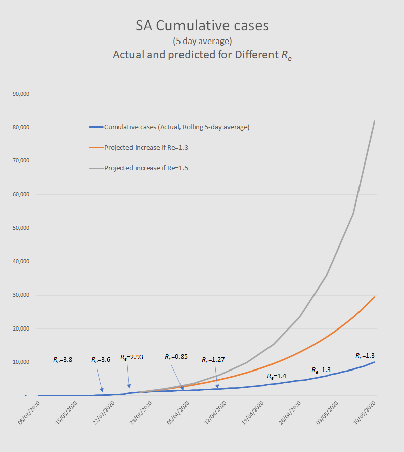
The difference between a rate of growth of 1.5 from 27 March compared with what actually happened is that, by 10 May, there would have been about 70 000 more cases. That delay in escalation with some 80% fewer cases over the period of lockdown was the purpose of the lockdown.
I need to say that the fact that the R came down is not proof that this was due to the lockdown. There are other potential contributing factors. But there is also circumstantial evidence that the lockdown has achieved significant reductions in how many contacts we each have and how far we travel. This is evidenced by cell phone mobility tracking. These are factors that most infectious disease experts think would likely reduce the rate of growth of infection, i.e. R.
Enormous uncertainty
In conclusion, there is enormous uncertainty about how the epidemic is evolving and what is driving its dynamics. It would be foolish to suggest anyone has all the answers. The uncertainty derives from all the familiar unknowns, such as relative numbers of asymptomatic cases and therefore actual spread of the infection in any population, degrees of population immunity, infection fatality rates, impact of environmental factors, population density, relative deprivation, co-morbidity with TB and HIV, and the effectiveness of preventive measures such as cloth masks, visors, and social distancing.
Less hubris, more humility, less certainty that one is right and that those with different interpretations are wrong, will be more helpful in ensuring that the scientific conversations continue and progressively converge on a common understanding of the epidemic and what we can do to mitigate it.
Max Price is a Non-Resident Fellow of the Centre for Global Development, and the former Vice-Chancellor of the University of Cape Town. He is a medically qualified public health expert and was formerly dean of the Faculty of Health Sciences at the University of the Witwatersrand.
[Picture: Michael Hammond, UCT, https://commons.wikimedia.org/w/index.php?curid=28391751]