If you want the lockdown to end because you think it worked and we can now relax, you need to see the graphs that follow.
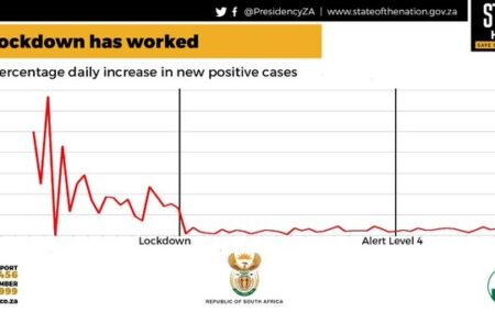
On 13 May, President Ramaphosa said there was ‘clear evidence that the lockdown has allowed us to achieve our objective of delaying the spread of Covid-19 and avoiding a massive surge in infections that would have overwhelmed our healthcare system’.
Attached to this statement, on the official @GovernmentZA Twitter handle, is the following graph.
It looks encouraging. But this graph does not show, as it purports to show, the increase of cases on any given day compared to cases on the previous day. Rather, it shows the increase on a day compared to the total number of cases up to that point.
In other words, 100% on the graph above means total cases doubled in one day. For example, on 10 March there were 4 cases confirmed in one day, but up until then there were a total of 3 confirmed cases. Hence the ‘daily percent increase’ was 133%, as you can see in the first spike above.
But when case numbers grow, such daily doubling cannot happen, so the curve is bound to flatten even if the virus is spreading like bushfire in the wind. Consider the same formula applied to Italy.
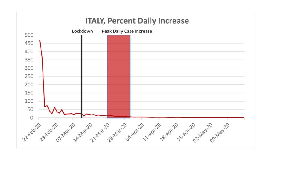
The graph above would be ‘clear evidence’, on the president’s formulation, that Italy’s curve was flattened significantly, long before its lockdown, and that its infection rate stayed low ever after.
Except, that is the opposite of what happened.
In the week after 23 February, when the graph above shows a ‘significant flattening’ of the curve, Italy was confirming roughly 60 cases per day. But by late March actual reproduction of the virus ripped through Italy with 6 000 new cases being detected per day in the peak highlighted above.
In short, the kind of graph the president used as ‘clear evidence’ tells you so little that it makes invisible one of the world’s worst epidemic peaks in 2020. Ramaphosa’s use of this graph does tell you something about the presidency, the government, and those media bosses who left it un-fact checked.
The government is not alone in misleading the nation with specious graphs. On 27 April, trained doctor and former Vice Chancellor of UCT, Max Price, provided this graph to boast of SA’s ‘significant flattening of the curve’ of Covid-19 cases in comparison with the UK.
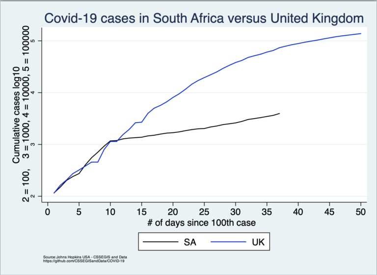
Again, it looks great. The graph seems to show more ‘incontrovertible evidence’ that we flattened the curve with the ‘kink’ appearing on 27 March, the day after the lockdown.
But Price also fails to contextualize this with testing rates, creating the misimpression that we have outperformed the UK. Even the London Sunday Timeswas duped, republishing Price’s piece.
As you can see from the graph below SA’s ‘kink’ towards a flatter curve in new cases comes at exactly same time as a ‘kink’ towards a flatter curve in new tests.
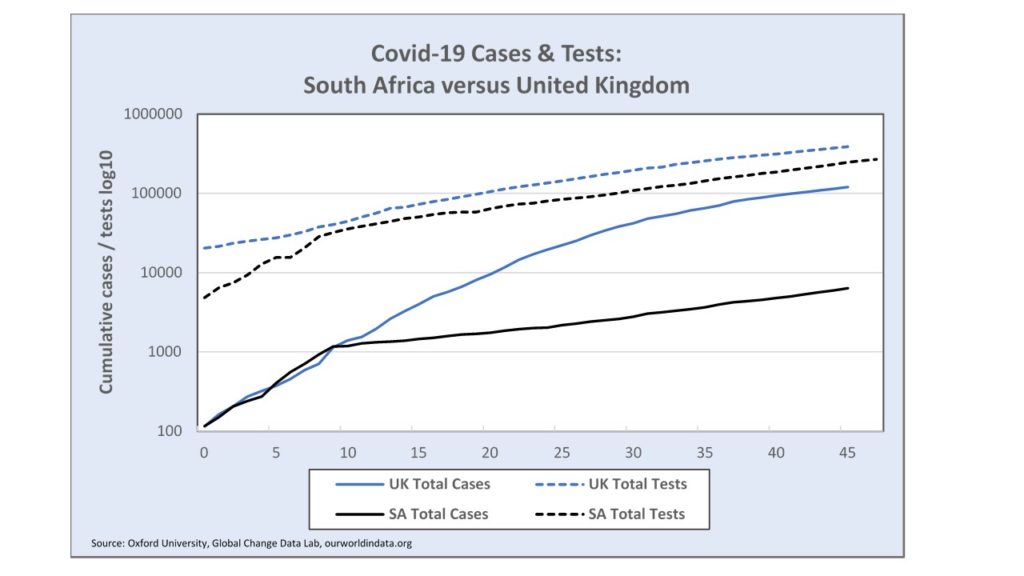
Sadly, what you see above is that we didn’t flatten the Covid-19 curve, we ‘kinked’ the testing. Here is an important graph to get the bigger picture of the relation between testing numbers and the number of cases detected.
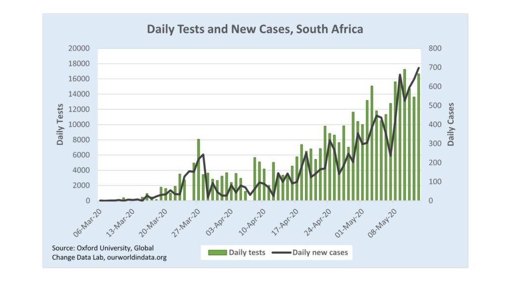
Price says SA is ‘exceptional’ at ‘flattening the curve’, but this graph shows where SA’s true exceptionalism lies. Leading up to the lockdown, we ramped up testing aggressively, and then spiked at 8 066 tests on 27 March. Then testing dropped to half that rate in a day, and then in half again in a week, and then eventually to zero on 6 April. No other country has done this. No other ‘Command Council’ locked a country down to drop, and then stop, testing.
This particular testing spike-and-dip created the false impression of a spike in cases being suddenly averted and then reversed right after the lockdown started. This anomaly has allowed lockdown champions to claim glory for the government.
‘In the week prior to the lockdown,’ Saul Musker wrote, ‘confirmed cases were increasing at an average of 33%. In the weeks since, that rate has stabilised at between 4% and 6%’, thus there is ‘incontrovertible evidence’ that ‘the lockdown worked’.
It gets worse. On 13 May, Ramaphosa boasted about SA’s low case numbers compared to the US, UK, Spain, Italy, and Singapore, but failed to observe that our testing (relative to the time since the first 100 cases and relative to population) has been much lower than those countries too.
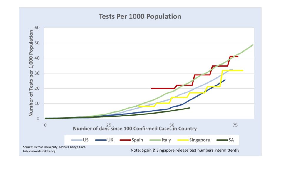
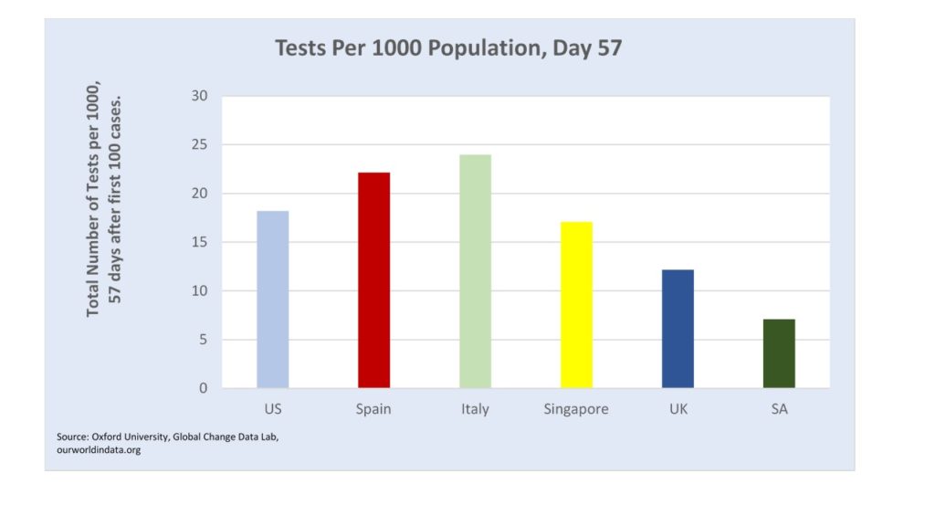
Here is another way of looking at it, showing tests in various countries 57 days after their first 100 confirmed cases.
Are the testing numbers so erratic that we can tell nothing about the true infectious curve? In April, I used a formula established by a Harvard professor of strategy and a mathematics professor at the Hebrew University of Jerusalem to approximate the ‘effective reproduction rate’ of SARS-CoV-2 in SA. That formula has since been improved in the Harvard Business School working paper to account for limited variances in testing like those we have seen in the week since 6 April, and I have updated it accordingly.
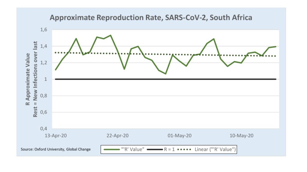
Here, the thing to know is that if ‘R’ is above one that means the virus is growing exponentially, otherwise it is shrinking. Our testing data, which has been much more stable over this period, indicate that Covid-19 spread exponentially since lockdown Level 5.
Experts have advised that if testing data is uncertain then death rates must be consulted to estimate the rate of viral penetration. This graph shows the total number of deaths and, in the bars below, the number of deaths per day up to 17 May.
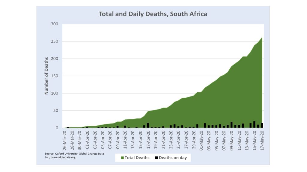
Bear in mind that there is a delay between infection and death. The average period is estimated to be 18 days, which means the overwhelming majority of deaths in May were due to infections that took place before or during ‘Level 5’ in April. The rate of deaths is increasing, exponentially, (statistically, confidence is R ^ 2 > 0.99, which shows a very good fit).
This is corroborating evidence that Covid-19 continued to spread exponentially through Level 5 and Level 4 of the lockdown.
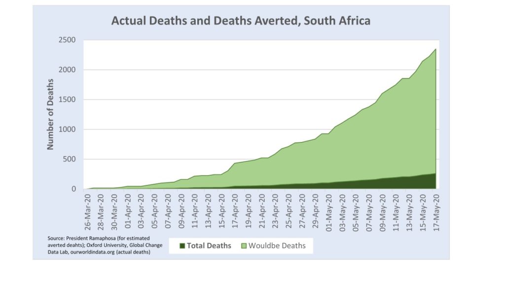
The next thing to consider is how much worse viral spread would have been if we had not entered lockdown. On 13 May, Ramaphosa claimed ‘the best current estimate is that, without the lockdown and other measures we have taken, at least 80 000 South Africans could have been infected by now.’
What Ramaphosa does not seem to realize is that we quite likely do have 80 000 infected by now, already.
For example, in New York State, 1 in 10 cases were undetected, despite far more tests per capita than South Africa, on 1 May, according to Worldometer. If 1 in 10 cases are going undetected in SA, then 110 000 were already infected here by 13 May.
Could it be any worse? In a sense yes. The president claims the ‘best estimates’ indicate deaths would have been 8 times greater without a lockdown. Here, that is graphically represented.
This growth is in line, albeit on the low end, with the kind of predictions Neil Ferguson of Imperial College London, made public on 16 March, prompting lockdowns around the world. Experts have found Ferguson’s computer models to be extraordinarily buggy, and unprecedentedly opaque.
But the fundamental problem with his model is simpler than that. In Ferguson’s paper, perhaps the most influential such document in history, he supposed that on a ‘do nothing’ approach to tackling Covid-19 there would be no ‘control measures’ and also no ‘spontaneous changes in individual behaviour’ [emphasis added].
‘Do nothing’ on Ferguson’s model means no one wears masks, or cancels their weddings, or holidays, or daily visits. It means not one person washes their hands more often. No one shifts to working from home, no factories refit, no schools and no universities shift to teaching online, no concerts are cancelled, no stores cap the number of customers that can visit at a time, and no one self-isolates. Not even one person.
On Ferguson’s ‘do nothing’ model, people that are sick, and know they are sick, with Covid-19 keep going to work, unmasked, unbothered, until they get sick enough to collapse or die.
Comparing SA’s actual deaths to this ‘do nothing’ alternative is deeply misleading. Is that what Ramaphosa and his ‘Command Council’ are doing? There is no way to know for sure, since the models have been kept secret.
If you like what you have just read, subscribe to the Daily Friend