

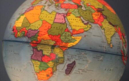
Africa is much bigger than the Mercator projection makes it look. Correcting that makes sense, but turning the size of a continent on a map into a question of dignity and justice is another matter.
On 4 September, the United Nations General Assembly voted overwhelmingly in favour of a resolution encouraging the use of world maps that more accurately represent the relative size of continents. The vote was 164 in favour, six abstentions and one against; the lone dissenter was the United States.
At first glance, this seems an odd hill for the Americans to die on. The basic case for changing the map is, after all, perfectly reasonable. The world map most of us grew up with is based on the Mercator projection, developed by the Flemish cartographer Gerardus Mercator in 1569. Mercator had a particular problem to solve. He was producing a map useful for navigation, not designing a classroom poster for teaching children the relative size of the continents.
For navigation it was enormously useful because it preserved angles and directions. But turning a spherical planet into a flat rectangle necessarily involves distortion, and on a Mercator map that distortion becomes increasingly severe the further one moves from the equator. Places in northern latitudes consequently appear much larger than they actually are. The most famous example is Greenland. On a Mercator map it can appear roughly comparable in size to Africa. In reality, Africa is about 14 times larger. So far, so straightforward.
The UN resolution encourages greater use of the Equal Earth projection and other equal-area projections, particularly where understanding the relative size of land masses matters. Equal Earth, developed in 2018, makes Africa look considerably bigger than it does on the Mercator map. Europe, Greenland, Russia and North America become correspondingly less visually dominant.
I don’t have any particular objection to this. In fact, if the purpose of a map hanging on a classroom wall is to give pupils a reasonable idea of the relative size of the continents, there is a good argument that Mercator is the wrong map for the job. We should probably teach children why different projections exist as well. There is no perfect flat map of a spherical Earth. You preserve some properties by distorting others. Unfortunately, the argument did not stop there.
Togo, which introduced the initiative on behalf of the African Group, the bloc of African states at the UN, presented the question as something considerably more profound than the teaching of geography. Its Foreign Minister, Robert Dussey, spoke about distorted maps contributing to the symbolic minimisation of Africa. The wider campaign has invoked dignity, historical memory, colonialism and what is described as ‘cognitive justice’. This is where I begin to lose the thread.
Africa appears too small on the Mercator projection. That is a factual statement. The claim that this may have helped people underestimate Africa’s scale is also plausible. Maps are repeated visual representations of the world, often first encountered in childhood, and it would be surprising if they had no influence at all on geographical perception.
Supporters of the change can therefore make a stronger argument than simply saying that Africa deserves to look bigger. They can say that, for generations, people were repeatedly shown a visual representation in which Europe, North America and Russia occupied far more of the world than they really do, while Africa appeared comparatively diminished. That may have reinforced a broader impression of Africa as peripheral to the centres of world affairs. That is a more serious argument, and it is worth engaging with. But it still does not get us all the way to dignity, justice or reparation. There remains, somewhere underneath the argument, a strangely juvenile assumption: that bigger is somehow better.
Why should appearing larger imply greater dignity in the first place? Does Greenland acquire enormous prestige from the Mercator projection? Have Greenlanders spent the last few centuries with inflated self-esteem because their island looks enormous on classroom maps? Has Russia’s immense geographical size translated into a corresponding measure of moral or political worth? Is Singapore somehow demeaned because it is barely visible on many maps? Physical size and importance plainly do not correspond very well.
There is also a difference between saying that a visual distortion can affect perception and saying that the distortion itself constitutes an injustice. That leap is much less obvious than its advocates sometimes suggest. Once size on a map becomes tied to dignity, marginalisation and historical repair, physical area starts doing rather a lot of moral work.
Nor was Africa made smaller because Mercator decided that Africans were less important than Europeans. The distortion is a mathematical consequence of the projection. Areas close to the poles become increasingly enlarged. Canada is exaggerated for the same reason as Scandinavia. Greenland becomes gigantic. Antarctica becomes almost comical. Mercator was solving a navigational problem in the sixteenth century. He was not designing a visual theory of colonial hierarchy.
Of course, absence of intent does not settle everything. A technology or representation can have effects its creator never intended. The Mercator projection later became extremely widespread during centuries of European imperial expansion, and it is possible that its distortions sat comfortably with a world increasingly organised around European power.
But ‘sat comfortably with’ is not the same as ‘caused’, and neither is the same as ‘was designed to perpetuate’. Those distinctions matter. Once they disappear, almost any historical artefact can be retrospectively turned into a political statement. None of this means we have to keep using Mercator where it is inappropriate. We don’t normally respond to the technical limitations of 1569 by declaring them sacred traditions. If we have a better map for showing comparative area, use it.
This was essentially where the American objection began, although I think Washington ultimately overreacted. US representative Yaryna Ferencevych argued that what appeared to be a fairly harmless attempt to improve cartographic proportions had become attached to a much larger ideological project. She objected in particular to the language of reparations and ‘cognitive justice’, and argued that the UN was spending its energies on symbolic ideological questions rather than the more basic purposes for which it exists. There is also a fairly obvious practical question here: does the UN really not have bigger fish to fry? There are any number of problems that materially affect the lives of Africans — conflict, poverty, weak institutions, infrastructure, disease and education among them. Against that background, treating the proportions of a classroom map as a matter of justice and historical repair can feel rather detached from the things that would actually make African lives better.
There is something to that criticism. International institutions have developed an impressive ability to take relatively simple problems and surround them with an elaborate moral vocabulary. Often that makes agreement harder rather than easier.
The map is inaccurate in a particular way. We have maps which are more accurate in that particular way. We could simply use them. Apparently that isn’t enough.
Still, voting alone against 164 countries was unnecessary. It leaves the United States looking as though it objects to Africa being shown at its actual size, which I doubt was the intention. The resolution is non-binding, does not outlaw Mercator, and acknowledges that different projections serve different purposes. A more sensible position would have been to separate the cartographic question from the ideological claims attached to it. Yes, use equal-area projections where relative area is what we want to show. Yes, explain the limitations of Mercator in schools. Yes, children should know that Africa is dramatically larger than it appears on many familiar maps.
But none of that requires us to believe that a larger-looking Africa is somehow a more dignified Africa, or that changing a classroom map amounts to historical reparation. In that sense, this little argument about maps captures something broader about contemporary politics. A fairly reasonable proposition becomes attached to a much grander moral claim. People who dislike the grand claim then feel compelled to oppose the reasonable proposition as well.
One side cannot simply correct a map. It has to decolonise it and advance ‘cognitive justice.’ The other side cannot simply object to that language. It has to vote against the map. And so something which ought to be an interesting discussion about the unavoidable compromises involved in representing a spherical planet on a flat piece of paper becomes another battlefield in the culture war. Perhaps we should use Equal Earth more often. I think we probably should. Africa is bigger than the Mercator projection makes it look. That is reason enough.
[Image: Globe map]
The views of the writer are not necessarily the views of the Daily Friend or the IRR.
If you like what you have just read, support the Daily Friend